You can feel it before you can name it: the indigo-to-violet gradient, Inter on white, a hero followed by three cards each with an emoji, one border-radius on everything, one soft shadow under everything, and a headline that promises you can *build the future of work*. It is the look of a page that a model made, and teams now burn real time and tokens trying to make their AI output not look like AI. The usual explanation is that escaping the look takes taste, a thing the model lacks and cannot be written down.
We think that is half right. The model does lack taste. But the thing to be escaped is not ineffable. The AI look is a *distributional artifact*: the set of choices that are individually unremarkable but collectively over-represented because they sit at the mode of the training data. Indigo is the default because Tailwind's own examples defaulted every button to it years ago, and the model learned that "modern" correlates with purple. Anything finite and recurrent can be written down, weighted, and measured.
The look, enumerated
We catalogued the recurring signals into 27 tells across eight families: color, type, layout, spacing, surface, motion, copy, and a field-derived one, AI self-reference (more below). Each tell is defined operationally (what to detect), justified by why a model defaults to it, and paired with the fix a designer would make. The loudest are the obvious ones, the indigo palette and the Inter default, but the most *telling* are the quiet ones: interactive elements with no designed hover, focus, or active states, and a missing focus ring, the residue of microstates and accessibility that were never considered.
A transparent detector reads a single HTML file, resolves both raw CSS and Tailwind utility classes, and reports a Tell Score from 0 to 100, the weighted fraction of the tells that fired. Lower is better: zero reads as authored, high reads as the median of the training set. There is no learned model and no opaque number; every point traces to a named tell and a quoted piece of evidence. Each tell also carries a memorable nickname so the taxonomy is quotable, *The Sparkle Tax* for the reflex of bolting a sparkle icon onto anything "AI", *Lorem Shipsum* for placeholder copy that shipped, *Box-in-a-Box* for a card nested in a card.
Same page, the tells removed
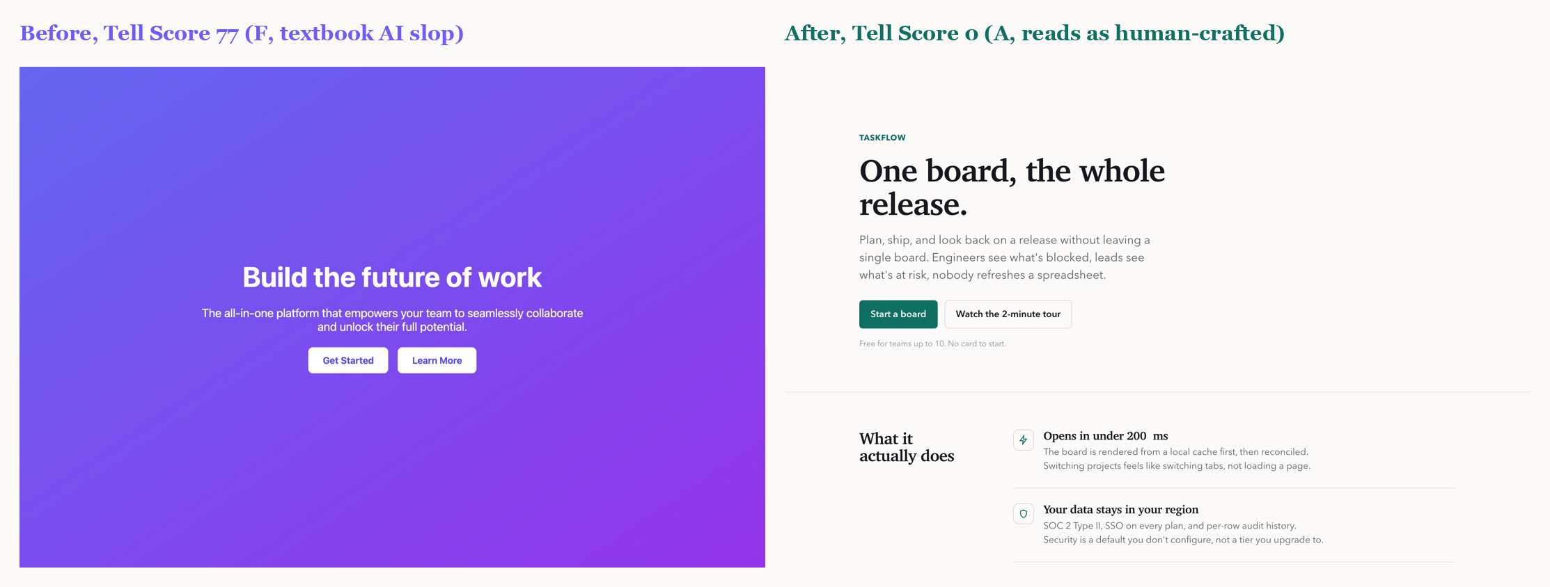
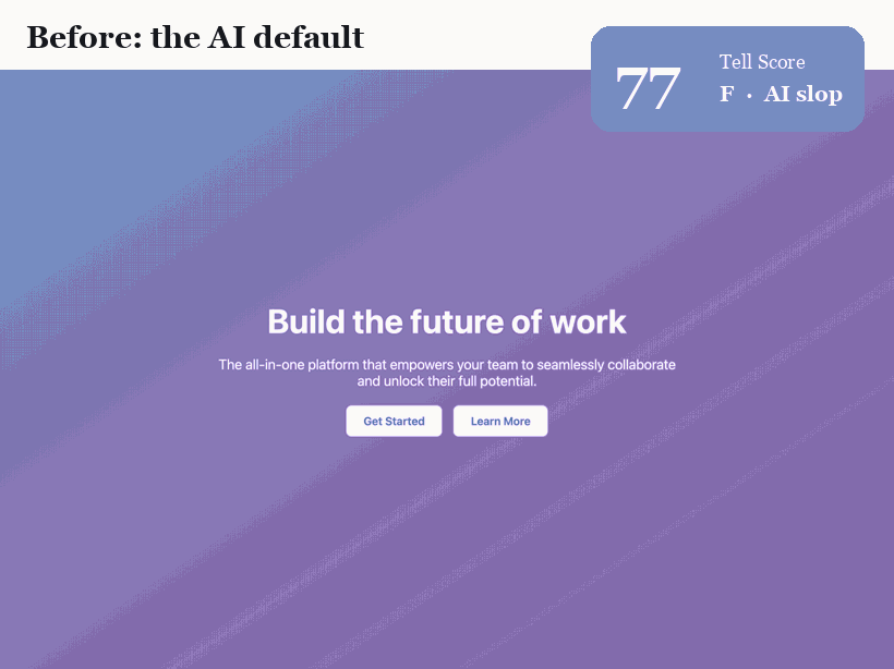
The headline result is deliberately confound-controlled. We take one landing page and refactor it so that *only the tell-bearing properties change*: the font, the color system, the alignment and grid, the radius hierarchy, the elevation and hairlines, the motion and microstates, and the wording. Same product, same four sections, same information. Nothing else moves. The Tell Score falls from 77 (grade F, textbook slop) to 0 (grade A). Any change is design, not content.
Across a six-page corpus the detector separates AI-default pages (mean 60) from designed pages (mean 0) with no overlap. We are honest about what this shows: the designed pages score zero *by construction*, because they were authored to be tell-free. That demonstrates the fixes are sufficient to zero the score; it is not a claim that real sites in the wild score zero. The load-bearing results are the confound-controlled refactor and the clean separation.
Validated on 202 real sites
A fair objection: maybe the detector just flags everything as AI. So we rendered 202 design-led, human-crafted sites (Stripe, Linear, Toss, Apple, Vercel, Figma, Notion, and 195 more) in headless Chrome, read their computed styles, and learned where real design actually sits. Recalibrated on that data, the 202 sites score at a median of 0, while the AI-default pages still stand far out at 35 to 59. The instrument distinguishes machine-default from human-crafted on real data, not just our own fixtures.
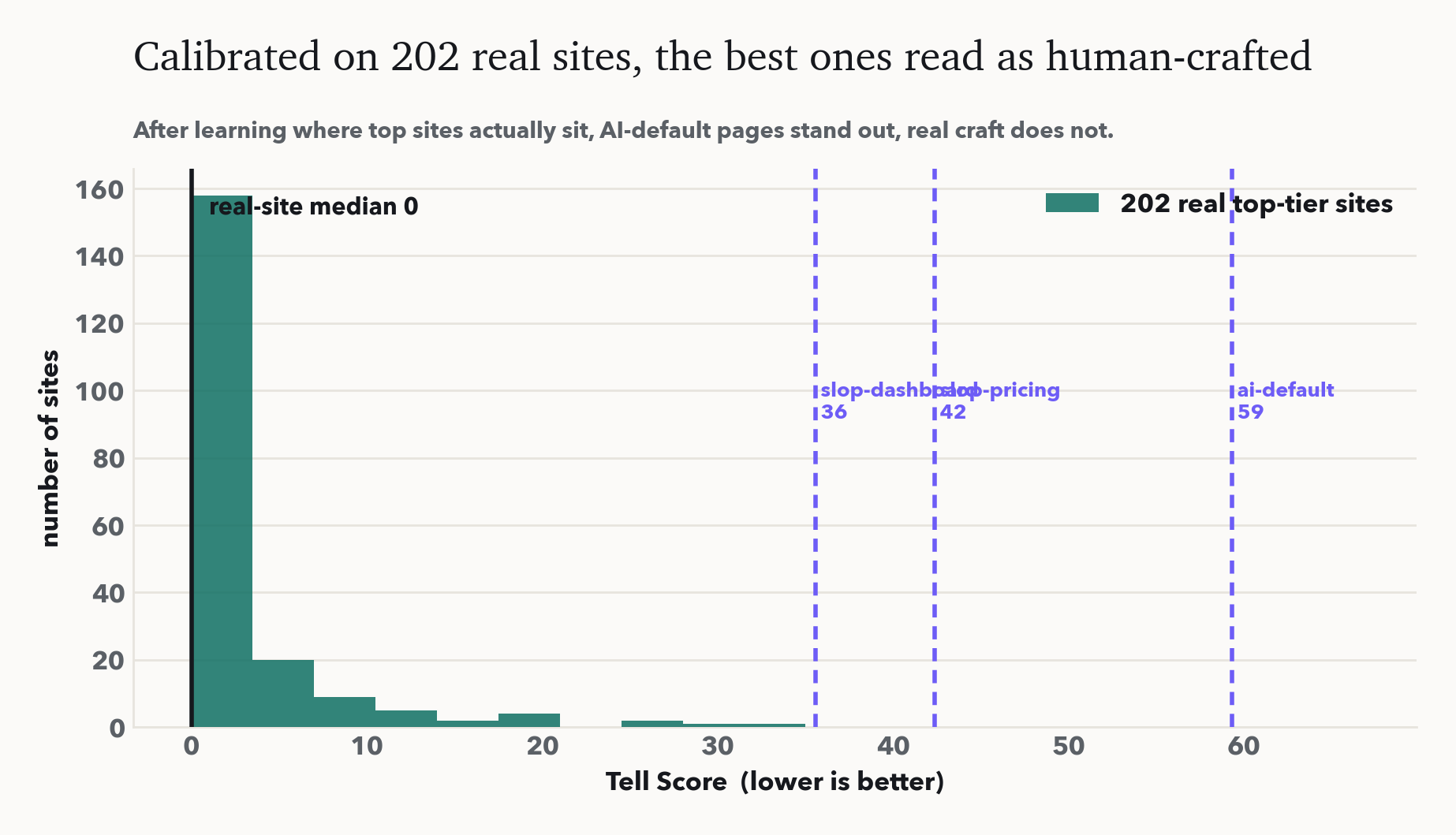
The data also corrects the folklore. A brand purple is not a tell: Stripe paints 123 purple accents and still scores 0, because a custom face, optical tracking and a radius hierarchy sit next to it. Inter is not a tell either: a quarter of top sites use it, Linear among them, with a real type system. So we score with a craft-credit model, where compensating craft offsets cosmetic defaults. No single signal is the tell. The AI look is the bundle of defaults with nothing decided next to them. The same detector now audits a live URL, not only a code string.
From "don't" to "do": a spec catalog
A detector only ever says what *not* to do. The question from anyone trying to actually build is the positive one: then what numbers should I use? So we read the answer off the same evidence. We rendered 199 of those sites a second time, and this round recorded the concrete CSS they ship per component, in both light and dark, twice per site under each prefers-color-scheme. The result is a measured reference, not a house style.
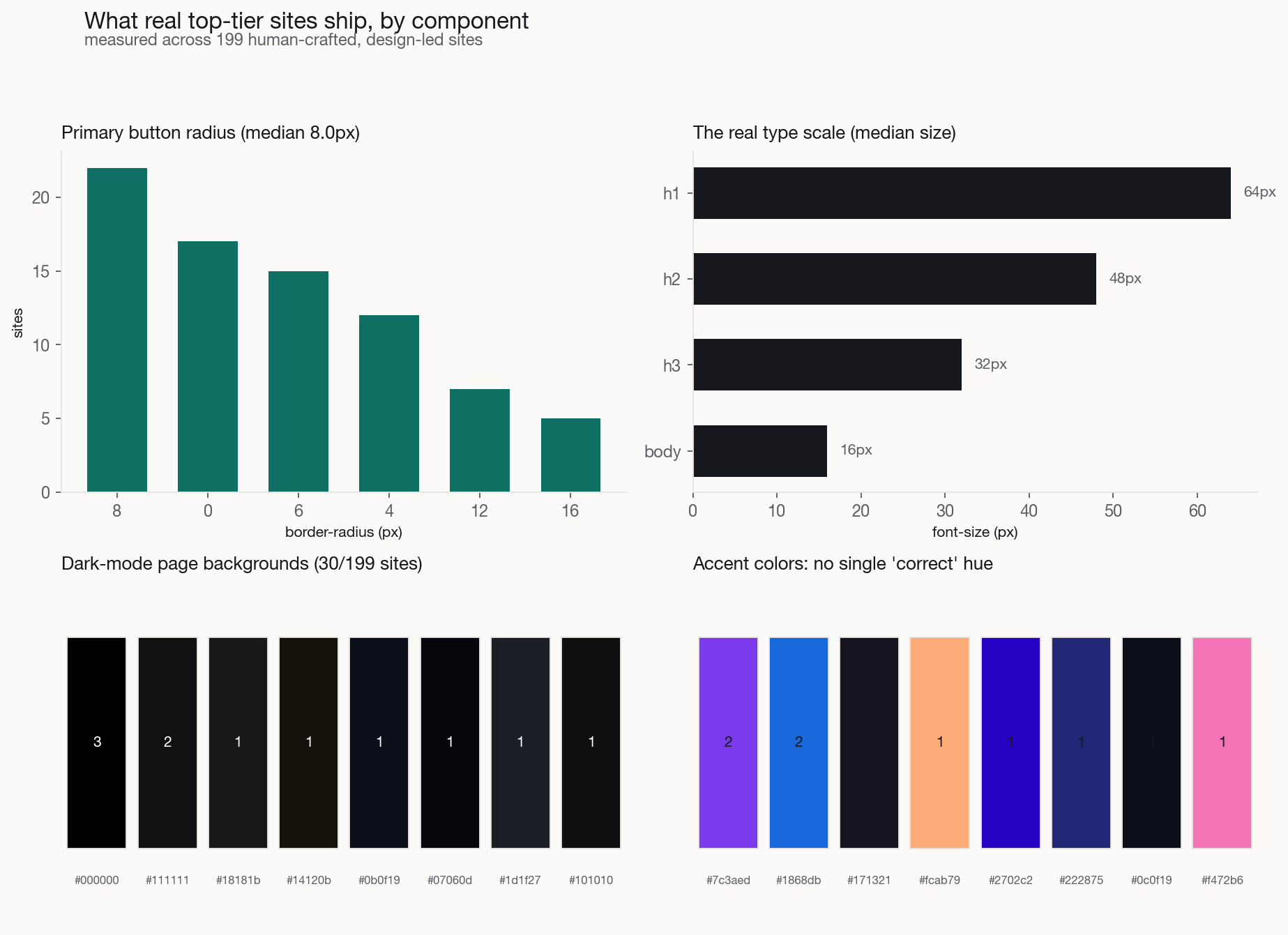
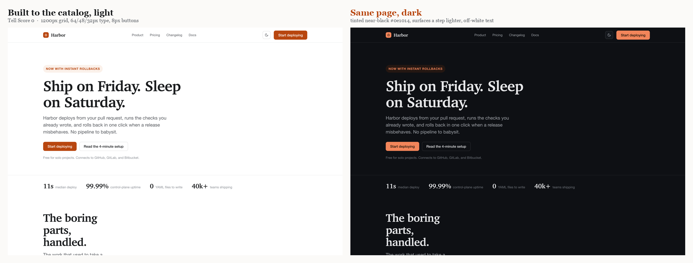
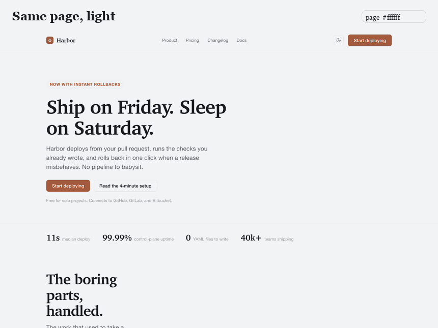
A few of the numbers. Primary-button corner radius does not converge on one value: it splits between a soft-rounded 8 to 12px cluster and a full pill, with sharp corners a deliberate minority and only 13% of buttons carrying any shadow. The real type scale lands near 64 / 48 / 32px for the heading levels over a 16px body, headlines on a tight line-height with frequent negative tracking. Content containers center on a 1200px median; spacing follows a 4/8px grid, but only about 70% of the time, not the religious adherence a generator assumes. And dark mode has a grammar: the page background is almost never pure black, it is a *tinted* near-black, raised surfaces sit a step lighter rather than a hairline border away, and text is an off-white. The full per-component tables, and a per-site appendix, ship in the repo as reference/COMPONENT-SPECS.md; the harness now carries these targets so its guidance is two-sided.
To prove the targets are buildable and not just describable, we assembled one landing page straight from those medians: a 1200px container, a 64/48/32px serif type scale, 8px buttons with every microstate, an owned amber accent instead of the default indigo, and a dark mode that follows the measured grammar. It is a single self-contained file, and it scores a Tell Score of 0 in both palettes.
Korean type is different, in two ways and not a third
The catalog above is mostly Western, and hangul is set differently from Latin. So we ran the same extraction over 48 Korean design-led sites (Toss, Kakao, 당근, 무신사, 29CM, 오늘의집, 배민, 업비트, and more) and compared. The honest result separates a real difference from a folk one.
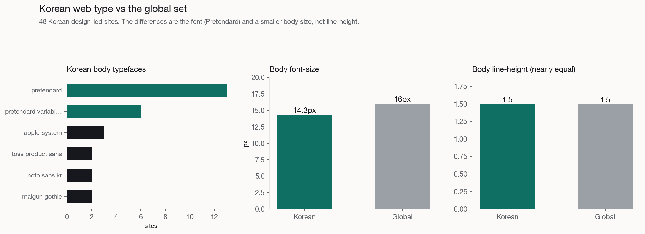
Two things really change. The font: Pretendard is the Korean web's Inter, the free, well-hinted default, on 44% of these sites as the body face and a hangul sans on 69%. So the type tell translates directly, bare Pretendard with no scale reads machine-default exactly as bare Inter does, and the owned move is a commissioned face (Toss Product Sans, Bithumb Trading Sans, Gmarket Sans, Wanted Sans). And the body size: Korean text sets smaller, a 14px median against 16px globally, because hangul carries more ink per glyph and Korean product culture is denser. The folk difference is line-height: hangul is often said to need far more leading, but the measured median is about 1.5 in both, because Pretendard already ships generous leading. One honest caveat: the Korean h1 median is bimodal, design-led product sites use 56 to 90px heroes like the West while portals and commerce are banner-driven with small or absent display headlines, so the low aggregate is a density culture, not a different idea of a headline.
What two teams had already banned
The sharpest confirmation came from the opposite direction. We had access to two production codebases whose maintainers, with no knowledge of this taxonomy, had already written their own internal design manifestos titled, in effect, *avoid the AI look*, and logged the cleanup with per-instance counts: one patched roughly 600 sub-12px labels to a 12px floor, the other listed every Sparkles icon to remove. Both are private commercial products, so we treat them anonymously as a dark-mode media tool and a productivity assistant.
Two findings matter. First, they independently named the tells the detector already had: the indigo default, the blue-to-purple gradient (banned in so many words as "AI 풍 그라데이션"), emoji-as-icon, the generic font, vague system-voice copy. Practitioners writing only to stop their own products from looking generated arrived at the same list, the strongest evidence the families are real and not an artifact of our framing.
Second, the field saw further. Both led with a register the taxonomy had not covered: the interface announcing itself as AI. We added it as a new family, H, AI self-reference, with three tells, plus three more in existing families:
- AI-cliché iconography, the Sparkles / Wand / Bot / Brain / Cpu icon set bolted onto any "AI" feature. - Labeling the feature "AI" or naming the model, "AI-powered", "AI 분석", an exposed GPT-4 or Claude in the UI. Name the function by what it does; show the model only in settings. - Generate, preview, then insert, the assistant-panel ceremony. Apply the result into the content and let the user undo. - Multi-color pill-badge inflation, a row of status pills each in a different bright hue. - Sub-legible micro-type, scattered 9 to 11px labels; set a 12px floor. - Nested card-in-card chrome, the "double box"; use one outer card with a flat divided list.
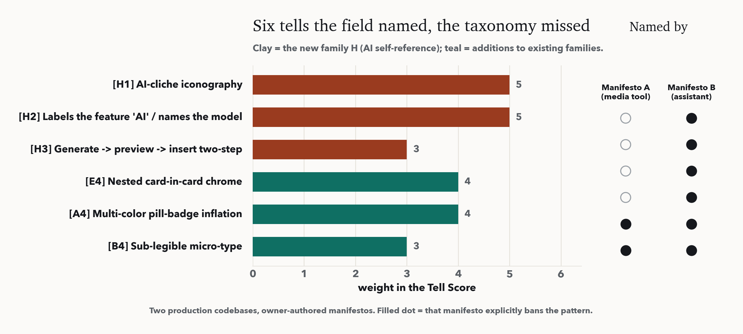
These six raise the taxonomy to 27 tells. They are detected by the code detector you run on the markup an agent just wrote, where icon imports and label text are visible; the live computed-style audit does not see them yet, which we state as a boundary, not a result.
A harness, not just a verdict
The taxonomy ships as a tool, three ways, all from one source. A command-line linter whose exit code gates CI. An MCP server, so a coding agent can audit the UI it just wrote *before* showing it to you, get the specific fixes, and iterate. And a drop-in prompt module that turns each detected tell into a preventive instruction you can paste into a system prompt, CLAUDE.md, or a v0/Lovable instructions field. The workflow is generate, score, fix, re-score.
Install it in one line
It is on PyPI and ships as a Claude Code plugin. The fastest path is the plugin: run /plugin marketplace add hankimis/ai-design-tells, then /plugin install ai-design-tells@iov-labs, and the MCP server is registered for you. Any other MCP client (Cursor, Claude Desktop) can point at the uvx command instead, and a plain pip install ai-design-tells gives the ai-design-tells command in your terminal. However it is wired, the agent then audits the UI it just wrote before showing it to you, returning each fired tell with its nickname, the evidence, and the fix, and looping until the Tell Score drops. The plugin and uvx paths run the server through uv, so install it once with curl -LsSf https://astral.sh/uv/install.sh | sh (or brew install uv); the plain pip path does not need it.
"It looks like AI" does not mean a machine made it. It means no one in particular made it. The gradient is not ugly; it is unowned. Removing the tells is the act of putting an owner back into the page.
There is a last irony, and it is the reason we keep the score humble. Our companion study, *Convergence Pressure*, found that what homogenizes a population is not AI assistance but the *loop* of everyone consulting the same oracle. A single, widely adopted design score is such an oracle. If every team optimizes the same Tell Score with the same fixes, the escape from the indigo mean becomes a new mean. The right use of the harness is the one we argue for throughout: a detector of the *absence* of a decision, a prompt to make a choice, not a prescription of which choice to make. It should send you toward your own distribution, not toward a new shared one. Code, data, figures, and harness are public.